본 페이지에서는 색상을 colorscale을 적용하여 꾸미는 방법을 말씀드리겠습니다.
*Scatter traces의 Dict-key: colorscale, colorbar 정보 참조
colorscale
Code: fig.update_traces(marker_colorscale=<VALUE>, selector=dict(type='scatter'))
Type: colorscale
Sets the colorscale. Has an effect only if in `marker.color` is set to a numerical array. The colorscale must be an array containing arrays mapping a normalized value to an rgb, rgba, hex, hsl, hsv, or named color string. At minimum, a mapping for the lowest (0) and highest (1) values are required. For example, `[[0, 'rgb(0,0,255)'], [1, 'rgb(255,0,0)']]`. To control the bounds of the colorscale in color space, use `marker.cmin` and `marker.cmax`. Alternatively, `colorscale` may be a palette name string of the following list: Blackbody,Bluered,Blues,Cividis,Earth,Electric,Greens,Greys,Hot,Jet,Picnic,Portland,Rainbow,RdBu,Reds,Viridis,YlGnBu,YlOrRd.

colorbar
Code: fig.update_traces(marker_colorbar=dict(...), selector=dict(type='scatter'))
Type: dict containing one or more of the keys listed below.
*colorscale 추가 설명
The 'colorscale' property is a colorscale and may be
specified as:
- A list of colors that will be spaced evenly to create the colorscale.
Many predefined colorscale lists are included in the sequential, diverging,
and cyclical modules in the plotly.colors package.
- A list of 2-element lists where the first element is the
normalized color level value (starting at 0 and ending at 1),
and the second item is a valid color string.
(e.g. [[0, 'green'], [0.5, 'red'], [1.0, 'rgb(0, 0, 255)']])
- One of the following named colorscales:
['aggrnyl', 'agsunset', 'algae', 'amp', 'armyrose', 'balance',
'blackbody', 'bluered', 'blues', 'blugrn', 'bluyl', 'brbg',
'brwnyl', 'bugn', 'bupu', 'burg', 'burgyl', 'cividis', 'curl',
'darkmint', 'deep', 'delta', 'dense', 'earth', 'edge', 'electric',
'emrld', 'fall', 'geyser', 'gnbu', 'gray', 'greens', 'greys',
'haline', 'hot', 'hsv', 'ice', 'icefire', 'inferno', 'jet',
'magenta', 'magma', 'matter', 'mint', 'mrybm', 'mygbm', 'oranges',
'orrd', 'oryel', 'oxy', 'peach', 'phase', 'picnic', 'pinkyl',
'piyg', 'plasma', 'plotly3', 'portland', 'prgn', 'pubu', 'pubugn',
'puor', 'purd', 'purp', 'purples', 'purpor', 'rainbow', 'rdbu',
'rdgy', 'rdpu', 'rdylbu', 'rdylgn', 'redor', 'reds', 'solar',
'spectral', 'speed', 'sunset', 'sunsetdark', 'teal', 'tealgrn',
'tealrose', 'tempo', 'temps', 'thermal', 'tropic', 'turbid',
'turbo', 'twilight', 'viridis', 'ylgn', 'ylgnbu', 'ylorbr',
'ylorrd'].
Appending '_r' to a named colorscale reverses it.
colorscale의 적용에는 Discrete과 Continuous하게 적용하는 방법으로 나눌 수 있습니다.
아래에 예시에 함께 설명 드리겠습니다.
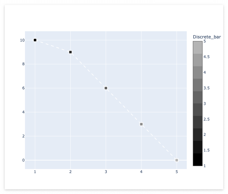
colorscale : Discrete-color
code: go.scatter의 colorscale에 값을 적용
*colorscale에 discrete한 색상을 적용하기 위해서 리스트에 각 색깔의 시작과 끝 부분에 같은 색상을 적용합니다.
import plotly
import plotly.graph_objects as go

x2 = [ 1, 2, 3, 4, 5 ]
y2 = [ 10, 9, 6, 3, 0 ]

fig = go.Figure()
trace2 = go.Scatter(
        x=x2, y=y2,
        mode='markers+lines',
        marker =dict( size= 10, symbol='square', line=dict(width=2), color=x2,
            colorscale=[
                    # Let first 10% (0.1) of the values have color rgb(0, 0, 0)
                    [0, "rgb(0, 0, 0)"],
                    [0.1, "rgb(0, 0, 0)"],
                    [0.1, "rgb(20, 20, 20)"],
                    [0.2, "rgb(20, 20, 20)"],
                    [0.2, "rgb(40, 40, 40)"],
                    [0.3, "rgb(40, 40, 40)"],
                    [0.3, "rgb(60, 60, 60)"],
                    [0.4, "rgb(60, 60, 60)"],
                    [0.4, "rgb(80, 80, 80)"],
                    [0.5, "rgb(80, 80, 80)"],
                    [0.5, "rgb(100, 100, 100)"],
                    [0.6, "rgb(100, 100, 100)"],
                    [0.6, "rgb(120, 120, 120)"],
                    [0.7, "rgb(120, 120, 120)"],
                    [0.7, "rgb(140, 140, 140)"],
                    [0.8, "rgb(140, 140, 140)"],
                    [0.8, "rgb(160, 160, 160)"],
                    [0.9, "rgb(160, 160, 160)"],
                    [0.9, "rgb(180, 180, 180)"],
                    [1.0, "rgb(180, 180, 180)"]
                ],
            colorbar=dict(
                    title='Discrete_bar'
                )
            ),
        line   =dict( dash='dash', width=2, color='#ffffff' ),
        showlegend=False,
        )
fig.add_trace( trace2 )

fig.show()
Output
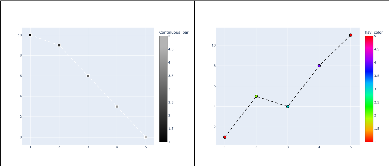
colorscale : Continuous-color
code1: go.scatter의 colorscale에 값을 적용
*colorscale에 Continuous한 색상을 적용하기 위해서 리스트에 각 색깔의 시작에만 색상을 적용합니다.
import plotly
import plotly.graph_objects as go

x2 = [ 1, 2, 3, 4, 5 ]
y2 = [ 10, 9, 6, 3, 0 ]

fig = go.Figure()
trace2 = go.Scatter(
        x=x2, y=y2,
        mode='markers+lines',
        marker =dict( size= 10, symbol='square', line=dict(width=2), color=x2,
            colorscale=[
                    [0, "rgb(0, 0, 0)"],
                    [0.1, "rgb(20, 20, 20)"],
                    [0.2, "rgb(40, 40, 40)"],
                    [0.3, "rgb(60, 60, 60)"],
                    [0.4, "rgb(80, 80, 80)"],
                    [0.5, "rgb(100, 100, 100)"],
                    [0.6, "rgb(120, 120, 120)"],
                    [0.7, "rgb(140, 140, 140)"],
                    [0.8, "rgb(160, 160, 160)"],
                    [0.9, "rgb(180, 180, 180)"],
                    [1.0, "rgb(180, 180, 180)"]
                ],
            colorbar=dict(
                    #tick0=0,
                    #dtick=1,
                    title='Continuous_bar'
                )
            ),
        line   =dict( dash='dash', width=2, color='#ffffff' ),
        showlegend=False,
        )
fig.add_trace( trace2 )

fig.show()code2:go.scatter의 colorscale에 값을 적용
*named colorscale 적용
import plotly
import plotly.graph_objects as go

x1 = [ 1, 2, 3, 4, 5 ]
y1 = [ 1, 5, 4, 8, 11 ]

fig = go.Figure()
trace1 = go.Scatter(
        x=x1, y=y1,
        mode='markers+lines',
        marker =dict( size= 10, symbol='circle', line=dict(width=2), color=x1, colorscale='hsv', colorbar=dict(title='hsv_color') ),
        line   =dict( dash='dash', width=2, color='#000000' ),
        showlegend=False,
        )
fig.add_trace( trace1 )

fig.show()
Output
추가적인 정보는 "Python Figure Reference: scatter Traces" 페이지를 참고 부탁드립니다.