python.plotly를 통해서 chart를 생성하고 다루기 위해선, Figure의 plotly.graph_objects의 인스턴스 혹은 dict를 다룰 줄 알아야 합니다. 기본적인 것부터 디테일한 부분까지 chart의 여러 부분들을 수정/조작할 수 있도록 이 블로그를 통해서 설명 드릴 예정입니다.
다양한 graph_objects들이 있지만, 주로 다루게 될 종류는 Scatter와 Bar traces로 설명 드릴 예정입니다.
Scatter Traces
Scatter Traces는 python.plotly에서 가장 많이 사용되는 graph_objects입니다. 그 이유는 scatter charts, line charts, text charts 그리고 bubble charts를 모두 구현해 낼 수 있기 때문입니다. 단순히 (x,y)정보만으로 point를 찍는 Scatter plot을 생성할 수도 있습니다. 여기에 text정보를 입히면 text chart를 생성할 수 있고, point의 사이즈를 조절하여 bubble chart를 생성할 수도 있습니다. 뿐만 아니라, (x,y)정보를 set로 구성하여 연결하면 line chart를 생성할 수 있습니다.
예시로 scatter, text, line charts를 생성하는 방법을 보여드리겠습니다.
*모든 예시는 px가 아닌 go로 보여드릴 예정입니다.
chart 스타일의 변경은 trace data의 mode(key)의 type을 변경해서 바꿀 수 있습니다.
*key: mode 정보 참조
mode
Code: fig.update_traces(mode=<VALUE>, selector=dict(type='scatter'))
Type: flaglist string. Any combination of "lines", "markers", "text" joined with a "+" OR "none".
Examples: "lines", "markers", "lines+markers", "lines+markers+text", "none"
Scatter charts
code : go.Scatter의 mode를 'markers'로 설정
#Scatter
import plotly
import plotly.graph_objects as go

x1 = [ 1, 2, 3, 4, 5 ]
y1 = [ 1, 5, 4, 8, 11 ]

fig = go.Figure()
trace1 = go.Scatter( x=x1, y=y1, mode='markers' )
fig.add_trace( trace1 )

fig.show()
Text charts
*key: text, textposition 정보 참조
text
Code: fig.update_traces(text=<VALUE>, selector=dict(type='scatter'))
Type: string or array of strings
Default: ""
Sets text elements associated with each (x,y) pair

textposition
Code: fig.update_traces(textposition=<VALUE>, selector=dict(type='scatter'))
Type: enumerated or array of enumerateds , one of ( "top left" | "top center" | "top right" | "middle left" | "middle center" | "middle right" | "bottom left" | "bottom center" | "bottom right" )
Default: "middle center"
Sets the positions of the `text` elements with respects to the (x,y) coordinates.
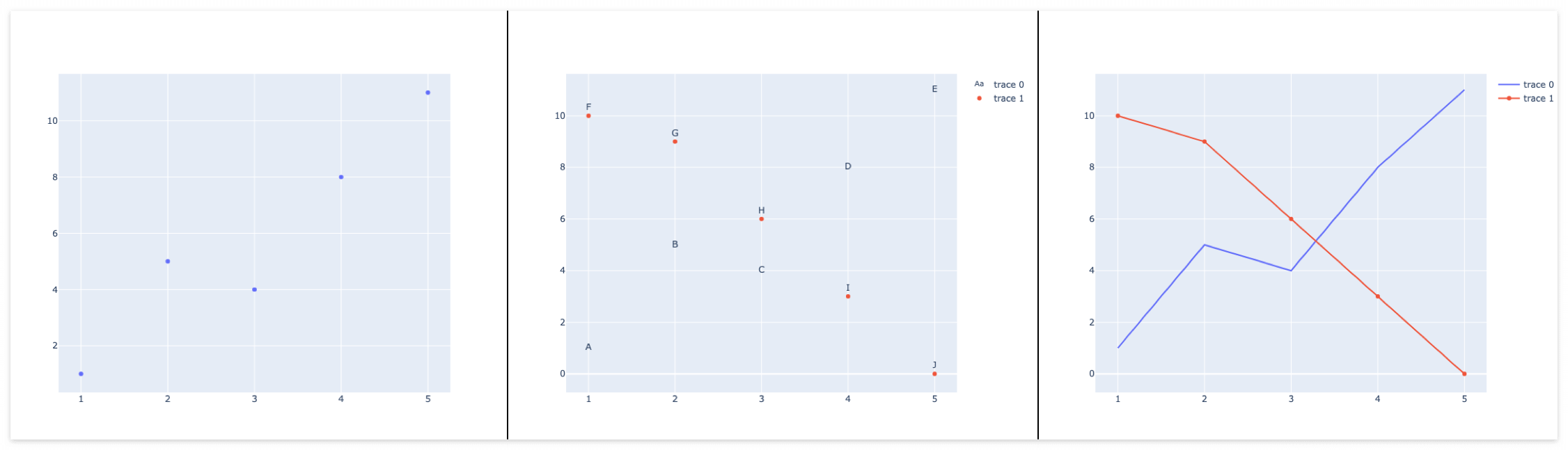
code :go.Scatter의 mode를 'text'로 설정하고, text 정보를 추가
*mode를 동시에 설정하고 싶은 경우 + 로 추가 합니다.
import plotly
import plotly.graph_objects as go

x1 = [ 1, 2, 3, 4, 5 ]
y1 = [ 1, 5, 4, 8, 11 ]
t1 = [ 'A', 'B', 'C', 'D', 'E' ]

x2 = [ 1, 2, 3, 4, 5 ]
y2 = [ 10, 9, 6, 3, 0 ]
t2 = [ 'F', 'G', 'H', 'I', 'J' ]

fig = go.Figure()
trace1 = go.Scatter( x=x1, y=y1, text=t1, mode='text' )
trace2 = go.Scatter( x=x2, y=y2, text=t2, mode='text+markers', textposition='top center' )
fig.add_trace( trace1 )
fig.add_trace( trace2 )

fig.show()
Line charts
code : go.Scatter의 mode를 'lines'로 설정
import plotly
import plotly.graph_objects as go

x1 = [ 1, 2, 3, 4, 5 ]
y1 = [ 1, 5, 4, 8, 11 ]

x2 = [ 1, 2, 3, 4, 5 ]
y2 = [ 10, 9, 6, 3, 0 ]

fig = go.Figure()
trace1 = go.Scatter( x=x1, y=y1, mode='lines' )
trace2 = go.Scatter( x=x2, y=y2, mode='lines+markers' )

fig.add_trace( trace1 )
fig.add_trace( trace2 )

fig.show()
Output
자세한 "Python Figure Reference: scatter Traces"는 아래의 페이지를 참고 부탁드립니다.
( https://plotly.com/python/reference/scatter/#scatter )